
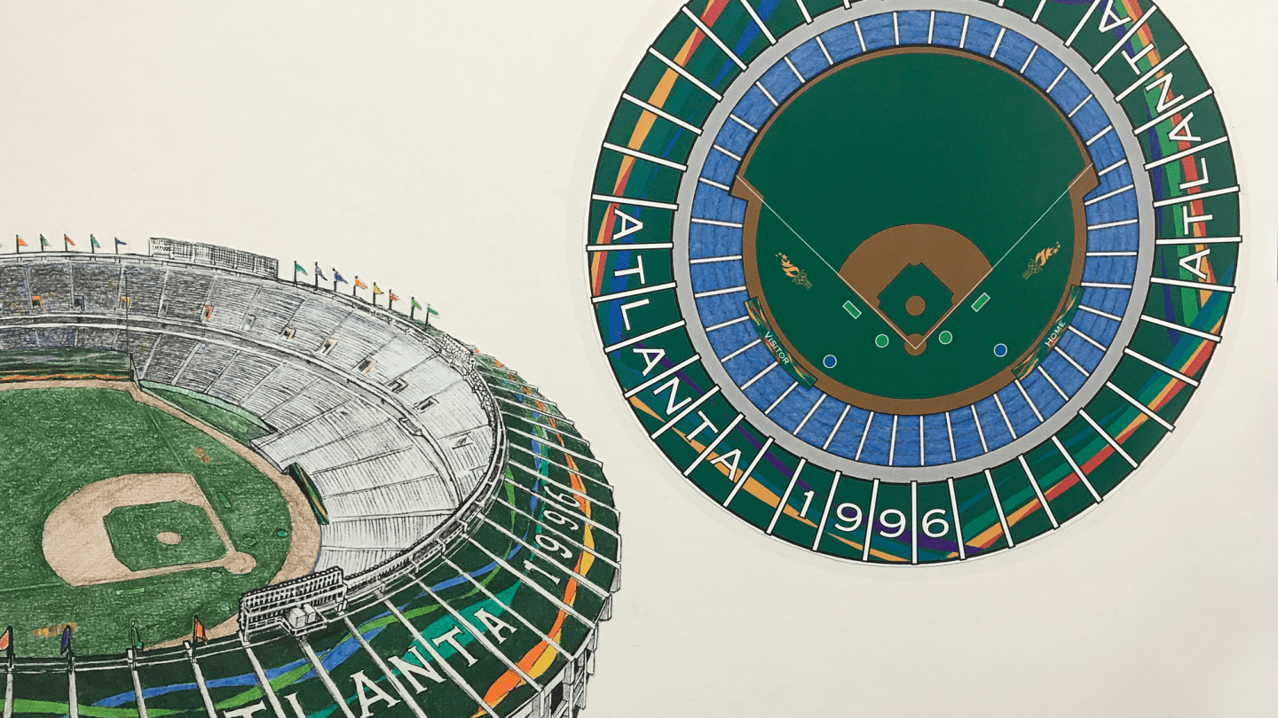
Detail of proposed Olympic graphics for Atlanta-Fulton County Stadium, Look of the Games committee presentation board | Atlanta Committee for the Olympic Games, circa 1994 | Gift of Brad Copeland, 2007
The 1996 Olympic and Paralympic Games presented Atlanta with a unique design opportunity. Designers needed to create a system that highlighted the history and culture of the American South while showcasing the host city. They also needed to develop an identity that commemorated the 100th anniversary, or centennial, of the modern Olympic Games. Atlanta wasn’t just the host city—it was the city of the century.
Like all the committees before it, the Atlanta Committee for the Olympic Games (ACOG) set out to discover how they would communicate their message—and the message of Atlanta—to the world. As is true with previous Games, the stories behind the creation of this visual language are as complex and compelling as the design process itself, full of struggle, innovation, and competition.
Unlike many other brand identities, every four years the Games’ identity is thrust into the center of a global conversation with an international audience. Often, the public reaction is very strong, either overwhelmingly positive or fiercely negative. Some identities prove timeless and linger in the graphic tradition of the city they represent; others are forgotten. Regardless of their level of success, each Olympic brand identity is steeped in historical meaning, reflecting the political atmosphere, spirit, and trends of the time and place. Atlanta’s was no different.
“More is More”
Creating the brand identities for the Olympic and Paralympic Games is one of the most rigorous and respected projects in the graphic design industry. These identities must represent a global franchise and seek to accomplish seemingly conflicting goals: they must be unique and universal, local and global, singular and timeless. Logos for the Games strive to capture the distinct culture of the host city while presenting universal iconography and imagery that resonates with the global audience they attract.
The designs must communicate relatively simple features, such as the year and the geographic location, in addition to incorporating the enduring Olympic logo–the five rings. The brand identity of each Games consists of a distinct logo, torches, mascots, and medals, among other things. It is meant to project a unified visual identity for the Games and for the host city, and is applied to merchandise and media.
Design has been integral to the Olympics since the first modern Olympic Games in 1896. As the influence of consumer culture rose during post-World War II decades, leaders within the International Olympic Committee abandoned their dedication to amateurism in favor of the financial prospects of corporate sponsorships and the professional sports industry. Olympic design expanded in scope from mere logos and posters to complex systems of visual communication and branding. Artists, architects, urban designers, art directors, and designers of all types were welcomed into the world of modern Olympic graphic identity planning.
Host cities imprint their own identity onto pre-established Olympic and Paralympic brands, conveying messages of national pride while maintaining the universality of the traditional Olympic intersecting rings and the Paralympic agitos—three asymmetric crescents that symbolize spirit in motion. The designs for the 1964 Games in Tokyo famously represented a post-war Japanese resurgence, using modern design techniques that attempted to both honor and revitalize Japanese historical tradition.
Tokyo’s brand identity, created by Yusaku Kamekura, became a template for the future of visual communication. Designers developed a set of pictograms—simple pictorial symbols used instead of written words—to identify important events and locations for audiences that spoke different languages. Pictograms were used prior to the Tokyo Olympic Games, but they were greatly refined and permanently cemented into the culture of Olympic design under the direction of Kamekura and his team in Tokyo. Since 1964, pictograms have been a central feature of the visual identity of each iteration of the Games, with every host city producing a creative variation of Tokyo’s original.
Design work for the 1968 Olympic Games, Mexico City | Left: View of the graphic treatment surrounding Estadio OlÍmpico Universitario, Mexico City, 1968 | Right: Logo variations for the 1968 Olympic Games, Mexico City | Courtesy Lance Wyman Archive
The brand identity of the Games in Mexico City, Mexico (1968) by Lance Wyman and Munich, Germany (1972) by Otl Aicher both implemented complex visual languages, linking event locations and city pathways, communicating a cultural identity, and influencing structural and social designs beyond the scope of the Games. This identity affected more than just sporting events. Wyman’s design work for the Mexico City Games was co-opted during student-led protests for economic and governmental reform. The protesters used the Mexico ‘68 logo as a means of communicating how their movement was met with violence and was silenced to make way for the Olympics.
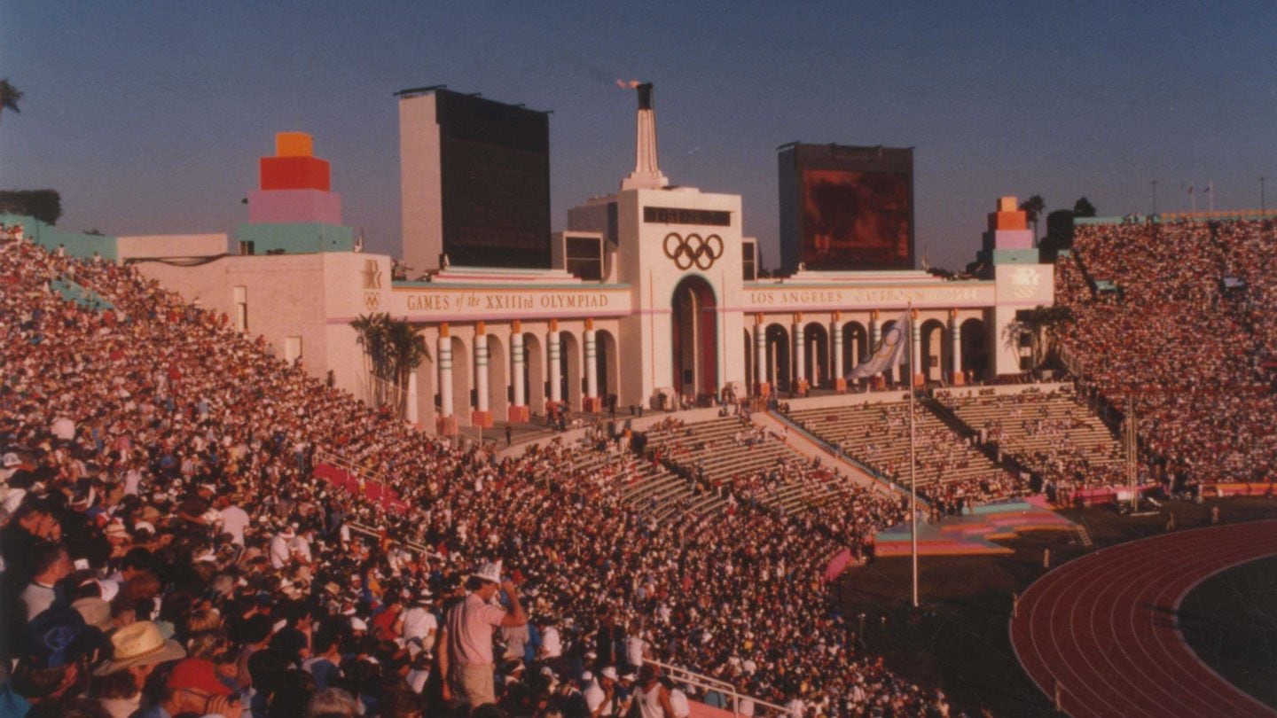
View of peristyle end of Los Angeles Memorial Coliseum during the 1984 Olympic Games Tom LaBonge, photographer | Courtesy Los Angeles Photographers Collection, Los Angeles Public Library
In 1984, Deborah Sussman, along with Paul Prejza and Jon Jerde, defined a system of shapes, colors, motifs, and design components of different formats to make Los Angeles pop for the Games. Sussman’s visual language brought her motto, “more is more,” to life. But her plan was also to create more for less. The city of Los Angeles was speckled with banners, piping, and environmental graphics that were temporary and more financially affordable in comparison to past Olympic design projects.
Detail of a proposed interactive sculpture, Look of the Games committee presentation board Malcolm Grear Designers, circa 1994 | Gift of Brad Copeland, 2007
Atlanta’s Olympic and Paralympic designs drew inspiration from these predecessors.
Emblematic Designs
Logos are a central feature of every brand identity, and Olympic Games are no exception. For the Games, the logo is the recognizable emblem that appears on t-shirts, banners, buildings, murals, pins, badges, and even on the gold medal. The designers for the 1996 Olympic Games in Atlanta created the Centennial Torch, with an orange flame and four colored stars, to be their logo; the Paralympic Games designers made the Starfire, a navy-blue star complemented with golden rings and an orange flame.
Although the Atlanta-based brand design firm Copeland Design, Inc., created the original bid logo that helped bring the Games to Atlanta, the leaders of the Atlanta Committee for the Olympic Games wanted a new logo that would commemorate the centennial of the modern Olympic Games. Local and national design firms competed for the committee’s attention, and they eventually selected a design from the San Francisco-based Landor Associates.
Sketches for Olympic Games logo designs | Copeland Design, circa 1990 | Gift of Brad Copeland, 2019
Landor’s winning Centennial Torch design is composed of a flame of stars that rises from the top of a torch base. The base resembles a classical Greek column and incorporates the Olympic rings and the number “100.” The colorful rising stars culminate in a perfect gold star, representing the achievement of an Olympic gold medal. The backdrop is a deep “Georgia” green. Although the Atlanta Committee for the Olympic Games had carefully chosen Landor’s design, Atlanta’s design community criticized the emblem’s limited connection to the city and resented the use of an outside designer. Copeland Design, Inc., the design firm that had created the bid logo, was later given the opportunity to create the Paralympic emblem, Starfire.
Detail of the Centennial Torch trademark from ACOG Graphic Standards Manual | Landor Associates, Atlanta Committee for the Olympic Games, 1992 | Georgia Amateur Athletic Foundation Collection, Kenan Research Center at Atlanta History Center
Detail of Starfire trademark from Atlanta Paralympics Organizing Committee Graphic Standards Manual | Copeland Design, circa 1990 | Gift of Brad Copeland, 2019
To put their visual languages into action, the Olympic and Paralympic design committees developed Graphic Standards Manuals. These handbooks (which can be seen as PDFs here) outline the necessary details for proper use of the logos, marks, and motifs, from the exact colors for printing to the font specifications. Produced for each Olympic Games and most large-scale design projects, these manuals have become desirable collectable items for designers and history buffs alike.
Stitching It All Together
Two and a half years before the start of the 1996 Summer Games, the Atlanta Committee for the Olympic Games began to craft their design plans into a cohesive “look.” They wanted to create an overarching visual language for the Games that included a cohesive color palette and important design motifs that could be represented across the range of images that encompassed this plan. Seeking to project the Olympic ideals of unity and sportsmanship, they brought together a committee of design firms from across the nation to accomplish their goal. The Look of the Games committee included Primo Angeli of San Francisco, Favermann Design of Boston, and Malcolm Grear Designers from Providence, along with Atlanta-based designers Jones Worley Design, Copeland Hirthler and James Murrell, and Turner Associates Architects & Planners.
The Look of the Games committee eventually chose two items to incorporate into the main design theme: a leaf and a quilt. The leaf referred to Atlanta’s status as a “city in a forest,” and the leaves of the laurel wreath that was worn in Greek Olympic tradition. The quilt referenced Southern artistic tradition as well as the Olympic ideal of many individual pieces coming together to tell a unified story. The committee combined these concepts into the “Quilt of Leaves,” the official look of the 1996 Olympic Games.
Color and motif specifications in ACOG Graphic Standards Manual | Atlanta Committee for the Olympic Games, 1992 | Georgia Amateur Athletic Foundation Collection, Kenan Research Center at Atlanta History Center
The Quilt of Leaves became the central component of the 1996 Olympic visual language. It was repeated, deconstructed, expanded, and translated across each element of Atlanta’s Olympic-scale design. During the Games, these patterns were seen at venues, on buildings, and in landscaping designs throughout metro Atlanta. Their bold colors and distinct messages made a lasting mark, and were even used to brand innovations, such as the first official Olympic website. They have lived on in the collective memory of our city, remembered through keepsakes from the Games, including tickets and souvenirs. The mural on Atlanta History Center’s parking deck is inspired by the design of the Olympic quilt. This quilt theme even prompted an international quilt-making project, for which quilter Helen Bell to sew a real quilt, which she gifted to the Games and which would be used to brand the first official Olympic website.
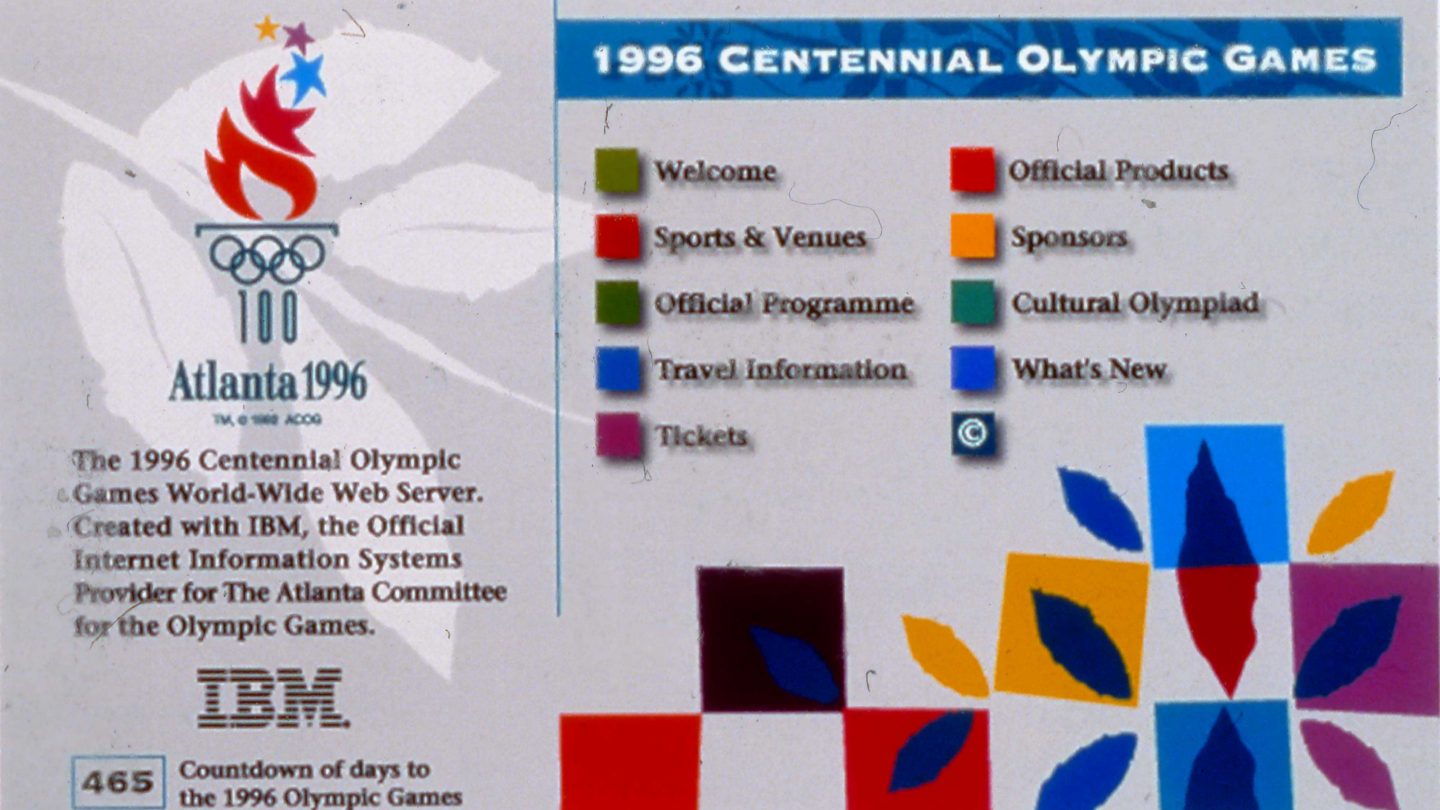
Homepage screenshot, 1996 Olympic website | IBM, Atlanta Committee for the Olympic Games, circa 1995 | Georgia Amateur Athletic Foundation Collection, Kenan Research Center at Atlanta History Center
Atlanta and the Paralympics
Planned separately from the Olympic Games, Atlanta’s Paralympic organizers had a unique set of design directives. The team planned for their Games to be the largest Paralympic event to date, and they needed a design that would fill more branding opportunities than prior. They sought to communicate the international expansion and recognition of the Paralympic Games and shine a light on the importance of disability rights .
Less is documented about the design development for the 1996 Paralympic Games because there were fewer design firms involved in the process. Copeland Design not only handled the logo, but also the look of the Paralympic Games. They developed the language of an “Ascending Flame” for their thematic motif. Atlanta’s Paralympic logo, StarFire, was intended to represent athletes fulfilling their dreams and the passion with which they competed. The fire of the Ascending Flame was complementary to the Olympic design, communicating Atlanta’s history of rising from the ashes while highlighting the resilience, perseverance, and activism of the disability community. Several venues in Atlanta were decorated with the flame, but city-wide decorations were not as widespread as for the Olympics.
In February 2020, the Paralympic logo was reworked. London design firm North sought to broaden the visual identity of the Paralympic Games to reinforce the organization’s dynamic spirit. North updated the colors to more closely match those of the Olympic rings and reworked the shape of the agitos. More than reworking the graphic design of the Games, a newly selected typeface (New Hero) lends a more energetic look to the brand’s bold voice.
Atlanta’s Games in Retrospect
Atlantans closely followed and often questioned the planning process for their hometown Games. An article in The Atlanta Constitution described the uncertainty that some people felt about the Atlanta Committee for the Olympic Games’ choices for the logo and themes.
Whether loved, hated, or dismissed during the Games , the look and brand identity of the 1996 Olympics and Paralympics has since been woven into modern Atlanta culture. Nostalgia about the Games is ever-present, with revivals found in recent fashion trends and local art, as well as fond memories kept alive and new interests ignited from the lasting presence of Centennial Olympic Park in the center of downtown Atlanta.
“[ACOG] so far has opted for neutral images that say little about the South or Atlanta, prompting concerns that the stage is being set for a characterless, generic Olympics.”
Atlanta History Center holds significant Olympic-related artifacts from the Georgia Amateur Athletic Foundation and local donors, as well as a growing collection of materials documenting Atlanta’s Paralympic history. Design history is one of the many stories these objects can tell. The collection includes process documents, sketches, prints, posters, venue signage, and objects from the Games. Together, these make up a time capsule of Atlanta’s ’90s design.
In 2020, Atlanta History Center opened a new signature exhibition, Atlanta 96, showcasing materials from these collections. Over 20 years after the 1996 Olympic and Paralympic Games, the exhibition considers the impact of the Games on the city and our lives. The Games mean something different to everyone, including individuals involved in preparations, people living near venues, competitors, and fans. The exhibition places this recent past within the context of Atlanta’s longer history of reinvention and growth initiatives, prompting visitors to think about how we can change the places we live.
Don’t miss the chance to see the looks of 1996 in this new exhibition.
Additional. Resources.
Articles + Archives
- 90.1 FM WABE | Nike Releases New Shoe To Commemorate 1996 Olympics
- Design Focus | The Design of Olympic Games Logos
- Dezeen | Olympics Logos since the 1920s: The Best and the Worst
- International Olympic Committee | Olympic Rings – Symbol of the Olympic Movement
- International Olympic Committee | The Olympic Pictograms, a Long and Fascinating Story – Olympic News
- Los Angeles Times | Is It an Olympic Logo? Or a Coquettish Scamp?
- Olympic Design Website
- Smithsonian Magazine | The History of the Olympic Pictograms: How Designers Hurdled the Language Barrier
- The Guardian | More Is More: The Gaudy Genius of the Late Deborah Sussman
Scholarly Articles
- Sport in Society, journal | Tokyo’s 1964 Olympic Design as a ‘Realm of [Design] Memory
- The Americas, journal | Showcasing the ‘Land of Tomorrow’: Mexico and the 1968 Olympics.
- Kang Sun | The Influence of Culture on Print Graphic Design: An Investigation / Research of Beijing 2008 and London 2012 Olympic Games Graphic Designs
- Harper, Laurel. “Olympic Design 1996: A detailed report on the design of the summer games in Atlanta.” Communication Arts 38, no. 2 (May/June 1996): 88-104.
Major support of this exhibition has been generously provided by the James M. Cox Foundation, Marine and John Fentener van Vlissingen, Bank of America, The Arthur M. Blank Family Foundation, The Coca-Cola Company, Martha and Billy Payne, The UPS Foundation, Martie and Dennis Zakas, and The Rich Foundation.